Predict fish phenology: basic
Morgan Sparks, Bryan M. Maitland
Source:vignettes/Predict_phenology_basic.Rmd
Predict_phenology_basic.RmdOverview
This vignette demonstrates a complete and simple hatchR workflow. We will use data installed with the package from Woody Island in Lake Iliamna, Alaska (Sparks et al. 2019), to predict the hatch and emergence timing of sockeye salmon (Oncorhynchus nerka).
If you have not already done so, see the vignettes on data checks and model parameterization.
Additionally, predict_phenology() has a companion
function, predict_spawn(), which works in the backwards
direction of predict_phenology(). It allows users to
predict spawn timing starting from known hatch or emergence timing—you
can read more about it in the Predict
spawning vignette.
First, we load needed packages:
Data checks
First, let’s check the data to make sure it’s in the right format.
We’ll print the first few rows and summary() to get a sense
of the data:
woody_island
#> # A tibble: 735 × 2
#>   date       temp_c
#>   <date>      <dbl>
#> 1 1990-08-11   25.8
#> 2 1990-08-12   23.3
#> 3 1990-08-13   18.5
#> 4 1990-08-14   15.4
#> 5 1990-08-15   14.0
#> # ℹ 730 more rows
summary(woody_island)
#>       date                temp_c
#>  Min.   :1990-08-11   Min.   :-9.900
#>  1st Qu.:1991-02-10   1st Qu.: 1.733
#>  Median :1991-08-13   Median : 4.442
#>  Mean   :1991-08-13   Mean   : 5.272
#>  3rd Qu.:1992-02-12   3rd Qu.: 7.767
#>  Max.   :1992-08-14   Max.   :28.700
You can see that each day already is summarized as a mean
temperature. You can also see that the data spans multiple years. We’ll
use plot_check_temp() to make visually check the data:
p <- plot_check_temp(
  data = woody_island,
  dates = date,
  temperature = temp_c
  )
p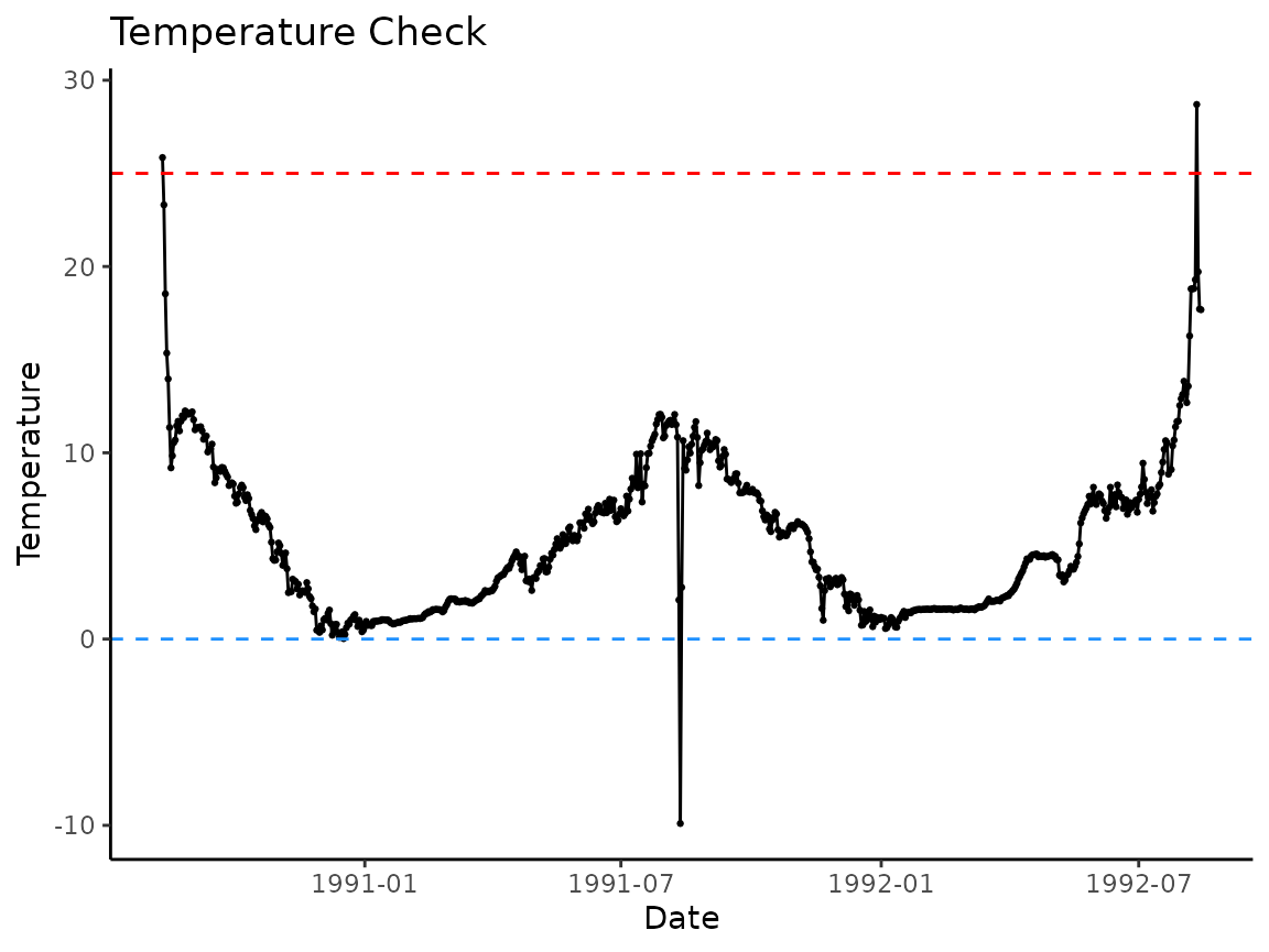
There appear to be outliers in the data, specifically in the very beginning and end of the period of record, and right in the middle. The loggers look to have been recording observations outside of the water and then in the middle where the water level may have dropped and exposed it to the air.
However, spawning in this system typically peaks around August 18 and
hatching and emergence are done before the start of the following
spawning season, so we can predict phenology within a subset of a year.
Because plot_check_temp() is a ggplot2
object, we can add additional plotting elements to the graph to
represent the approximate phenology window:
p +
  geom_rect(
    aes(
      xmin = ymd("1990-08-18"),
      xmax = ymd("1991-04-01"),
      ymin = -10,
      ymax = 25
    ),
    fill = "gray",
    alpha = 0.01
  )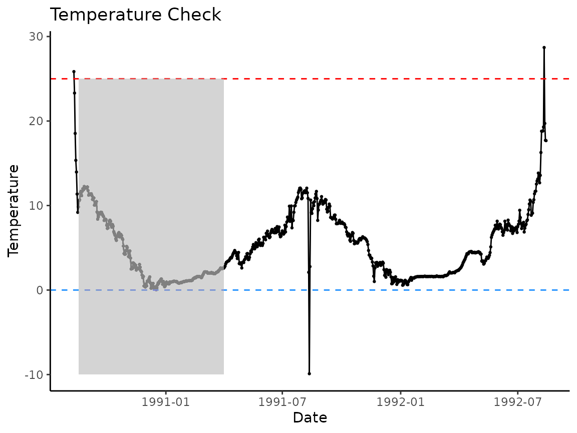
If we just apply the model within the gray polygon we’ve drawn, the model should work just fine.
Model select
Now that our temperature data is usable, we can select our models.
We’ll predict both hatch and emergence, so we will obtain a model
expression for each using model_select(). The only argument
in model_select() that must be changed in this case is
development_type, which can be either “hatch” or
“emerge”.
sockeye_hatch_mod <- model_select(
  author = "Beacham and Murray 1990",
  species = "sockeye",
  model = 2,
  development_type = "hatch"
)

sockeye_emerge_mod <- model_select(
  author = "Beacham and Murray 1990",
  species = "sockeye",
  model = 2,
  development_type = "emerge"
)
Let’s look at the model specifications for the two different parameterizations we’ve selected:
sockeye_hatch_mod
#> # A tibble: 1 × 5
#>   author                  species model_id development_type expression
#>   <chr>                   <chr>   <chr>    <chr>            <chr>
#> 1 Beacham and Murray 1990 sockeye 2        hatch            1 /exp(6.727 - log(…
sockeye_emerge_mod
#> # A tibble: 1 × 5
#>   author                  species model_id development_type expression
#>   <chr>                   <chr>   <chr>    <chr>            <chr>
#> 1 Beacham and Murray 1990 sockeye 2        emerge           1 / exp(7.227 - log…
You can see they are parameterized slightly different to account for the differences between hatch and emergence timing.
Predict phenology
We can now use our model expressions to predict when sockeye would
hatch and emerge at Woody Island in 1990. First we predict hatch timing
using predict_phenology():
WI_hatch <- predict_phenology(
  data = woody_island,
  dates = date,
  temperature = temp_c,
  spawn.date = "1990-08-18",
  model = sockeye_hatch_mod
)
#> Warning: ! Fish developed, but negative temperature values resulted in NaNs after
#>   development.
#> ℹ Check date(s): 1991-08-12
#> ℹ Fish spawn date was: 1990-08-18
Note the warning message that appears when you run this code for
woody_island. It reveals that while the fish developed, negative temperature values resulted inNaNs after development. More on this in the Negative Temperature section.
Next, look inside the returned object to see days to hatch and development period (more on this in the Understanding your results section)
WI_hatch$days_to_develop
#> [1] 74
WI_hatch$dev_period
#>        start       stop
#> 1 1990-08-18 1990-10-30
We can also do the same with emergence:
WI_emerge <- predict_phenology(
  data = woody_island,
  dates = date,
  temperature = temp_c,
  spawn.date = "1990-08-18",
  model = sockeye_emerge_mod # notice we're using emerge model expression here
)
#> Warning: ! Fish developed, but negative temperature values resulted in NaNs after
#>   development.
#> ℹ Check date(s): 1991-08-12
#> ℹ Fish spawn date was: 1990-08-18

WI_emerge$days_to_develop
#> [1] 204
WI_emerge$dev_period
#>        start       stop
#> 1 1990-08-18 1991-03-09
Understanding your results
The output from predict_phenology() includes a lot of
information. Here is a summary of the elements in the output list.
summary(WI_hatch)
#>                 Length Class       Mode
#> days_to_develop 1      -none-      numeric
#> dev_period      2      data.frame  list
#> ef_table        5      tbl_df      list
#> model_specs     5      spec_tbl_df list
We can access each element using the $ operator:
WI_hatch$days_to_developoutputs the predicted days to hatch or emerge.WI_hatch$dev_periodis a 1x2 dataframe with the dates corresponding to when your fish’s parent spawned (which you input withpredict_phenology(spawn.date = ...)) and the date when the fish is predicted to hatch or emerge.WI_hatch$ef_tableis a n x 5 tibble (n = number of days to hatch or emerge) and the columns are a row index, the date, each day’s temperature, effective value, and the cumulative sum of the effective values to that date. Theef_tableobject is meant to serve as the basis for users to make custom figures for their data beyond the functionality we discuss below.WI_hatch$model_specsis a tibble showing the model specifications used to predict the phenology.
Visualizing phenology
hatchR has a built in function,
plot_phenology(), that allows users to visualize their
phenology results. The plot visualizes three specific components:
- the temperature regime over which you are predicting
- the cumulative sum of effective values
- the effective value for each day in your prediction span
The function allows you to output various figures based on your interests, but defaults to a figure with all information and lots of labeling.
In the output of plot_phenology() the cumulative
effective values are scaled by the warmest temperature in
ef_table and the daily effective values are scaled
by multiplying by 100 so everything is visibly congruent in the
figure.
Let’s look at the basic call, which gives you all the information:
plot_phenology(WI_hatch)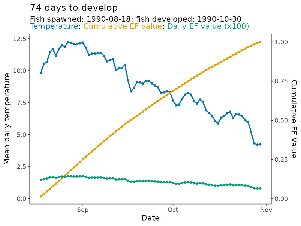
You can turn of labeling or plot specific values using the function
arguments style and labels, for example (plots
not rendered):
 # shows a plot with just the ef cumulative sum values
plot_phenology(WI_hatch, style = "ef_cumsum")
# shows a plot with just the ef daily values
plot_phenology(WI_hatch, style = "ef_daily")
# turns off the labeling for a cleaner figure
plot_phenology(WI_hatch, labels = FALSE)
A note about negative temperatures
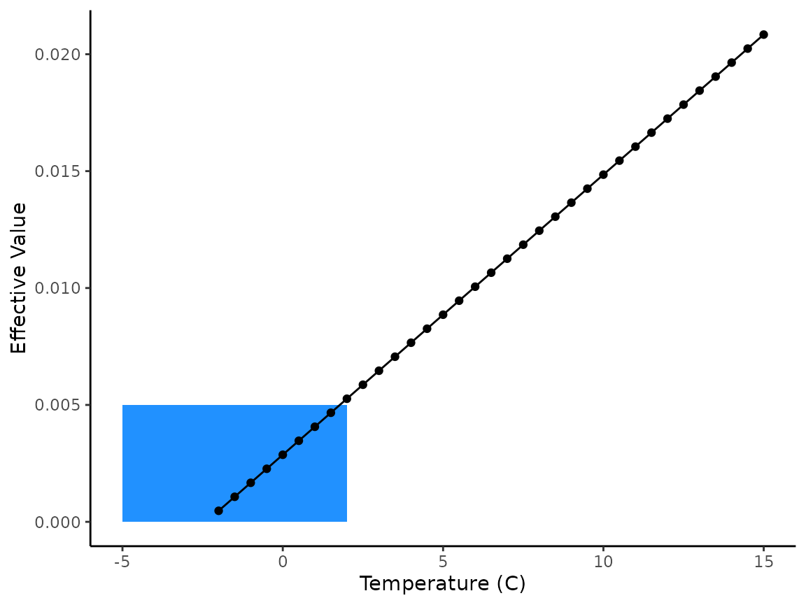
Occasionally, temperature data sets will have a few negative values
or values very close to 0. Negative numbers below a certain threshold
will output “not a number” (NaN) effective values because
they are undefined in the model expression and will break the function.
Similarly, even negative values above that threshold will produce very
small effective values. Because these values are so small, we allow the
model to accumulate them even though development below 0 is biologically
unlikely. We assume your data set has been checked for
these values and doesn’t include long periods of freezing, however the
model allows for the occasional dip below freezing because the effect is
so negligible toward development over incubation.
A toy example of this phenomenon is shown below.
# vector of temps from -5 to 15 by 0.5
x <- seq(from = -5, to = 15, by = 0.5)
x
#>  [1] -5.0 -4.5 -4.0 -3.5 -3.0 -2.5 -2.0 -1.5 -1.0 -0.5  0.0  0.5  1.0  1.5  2.0
#> [16]  2.5  3.0  3.5  4.0  4.5  5.0  5.5  6.0  6.5  7.0  7.5  8.0  8.5  9.0  9.5
#> [31] 10.0 10.5 11.0 11.5 12.0 12.5 13.0 13.5 14.0 14.5 15.0

# get effective values for those temperatures
# You can see the NaN warning that shows up in our past applications
demo_ef_vals <- eval(parse(text = sockeye_hatch_mod$expression))
demo_ef_vals
#>  [1]         NaN         NaN         NaN         NaN         NaN         NaN
#>  [7] 0.000472060 0.001071121 0.001670182 0.002269243 0.002868304 0.003467365
#> [13] 0.004066426 0.004665487 0.005264548 0.005863609 0.006462670 0.007061731
#> [19] 0.007660792 0.008259853 0.008858914 0.009457975 0.010057036 0.010656097
#> [25] 0.011255157 0.011854218 0.012453279 0.013052340 0.013651401 0.014250462
#> [31] 0.014849523 0.015448584 0.016047645 0.016646706 0.017245767 0.017844828
#> [37] 0.018443889 0.019042950 0.019642011 0.020241072 0.020840133

# bring together as a tibble
demo <- tibble(x, demo_ef_vals)
demo
#> # A tibble: 41 × 2
#>       x demo_ef_vals
#>   <dbl>        <dbl>
#> 1  -5            NaN
#> 2  -4.5          NaN
#> 3  -4            NaN
#> 4  -3.5          NaN
#> 5  -3            NaN
#> # ℹ 36 more rows

# plot (note NaNs are removed from figure)
# rectangle added to highlight the approximate temperatures of interest
demo |>
  ggplot(aes(x = x, y = demo_ef_vals)) +
  geom_rect(
    aes(
      ymin = 0, ymax = 0.005,
      xmin = -5, xmax = 2
    ),
    fill = "dodgerblue", alpha = 0.25
  ) +
  geom_point() +
  geom_line() +
  labs(x = "Temperature (C)", y = "Effective Value") +
  theme_classic()